04 Mused:
Visit museums in a different way
As the final project for my Bachelor's in computer graphics, I had to create a website that reflected my capacity as a UI designer and front-end developer. This evaluation was the conclusion of all our training during this web design study program. It was individual and I had 3 months to develop a convincing product or service. As teachers became mentors I was free to choose my own project and directions without restrictions. However, the final product would be presented to a jury of experts and needed to offer a complete experience.
Student Project (solo)
Bachelor’s thesis
BA Web & Mobile Design
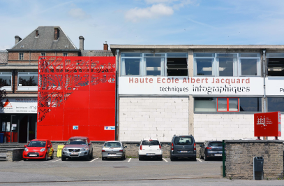
at Haute École Albert Jacquard
3 months (2021)
UX Research
UI Design
Front-End Dev.
Graphic Design
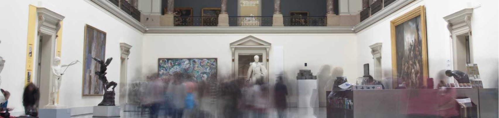
I noticed that to fully appreciate the art in a museum, we need to visit the museum multiple times. Because of the abundance of artwork in each of them, we become overwhelmed by the amount of information and/or our feet tire. After much consideration and brainstorming, I decided to create a website that allies art history and functionality in order to solve this problem.
I thought about a website/app that could help reduce this exhaustion by offering a guided tour on a particular subject for each visit. It would allow visitors to focus only on artwork they are interested in and would have a more targeted experience. Additionally, visitors could also visualize which museum tackles the same subject. It would help visitors to get ready before going to a museum and to organize their visits.
For this minimum-viable project, I chose to only focus on the Royal Museums of Fine Arts of Belgium. Nonetheless, this project has the potential to expand into multiple tours, diverse subjects, different museums, and different locations. I also chose to separate the project into two components, and I would only develop and design one of them for my bachelor project. The first one was the website. It would be a tool to anticipate the visit, arrange which guided tour visitors to take, and read some prerequisites. The second one would be the app that visitors would use to take the guided tour. I chose to not develop this part as it would resemble other audio-guided tour apps that are already in use today.
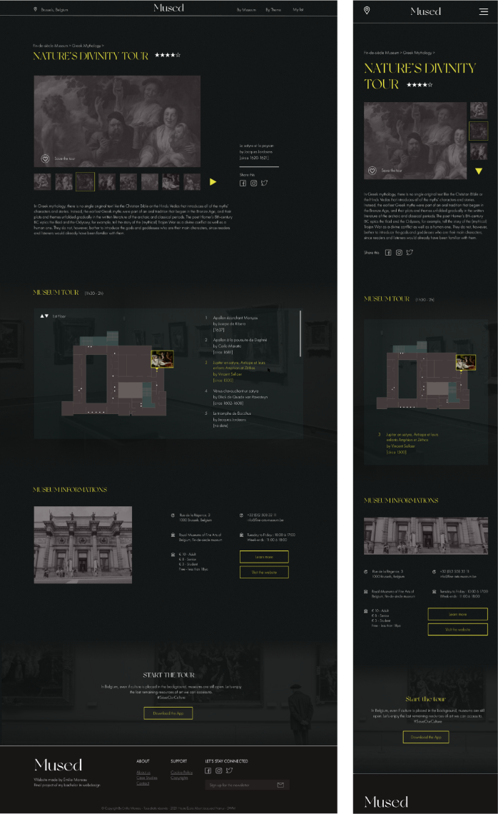
I started by going to the museum and collect as much information as possible. I mapped all the interesting artwork, I took note of all the paintings and sculptures that involve Greek and Roman mythology. I noticed that the regular audio guides are 16 artworks. That is when I decided to divide big themes into smaller thematic tours.
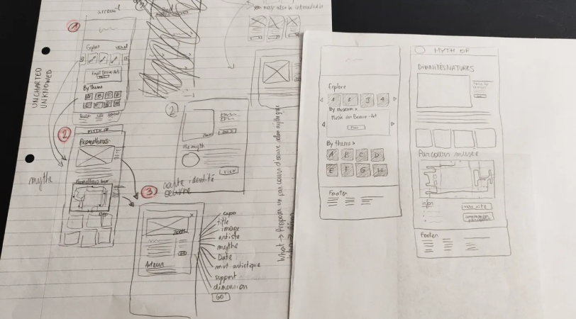
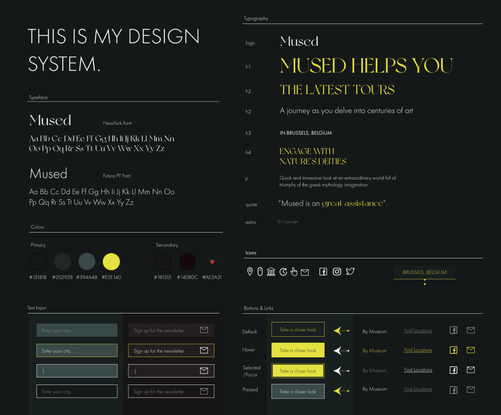
I already had a pretty good understanding of what my website would look like and how to navigate it. However, I didn’t know which elements were more important than the others. For this reason, I created a survey to understand my users’ needs. This survey provided feedback to evaluate the functionalities that I would develop in priority. With the results, I started sketching a prototype and transposed it on Figma.
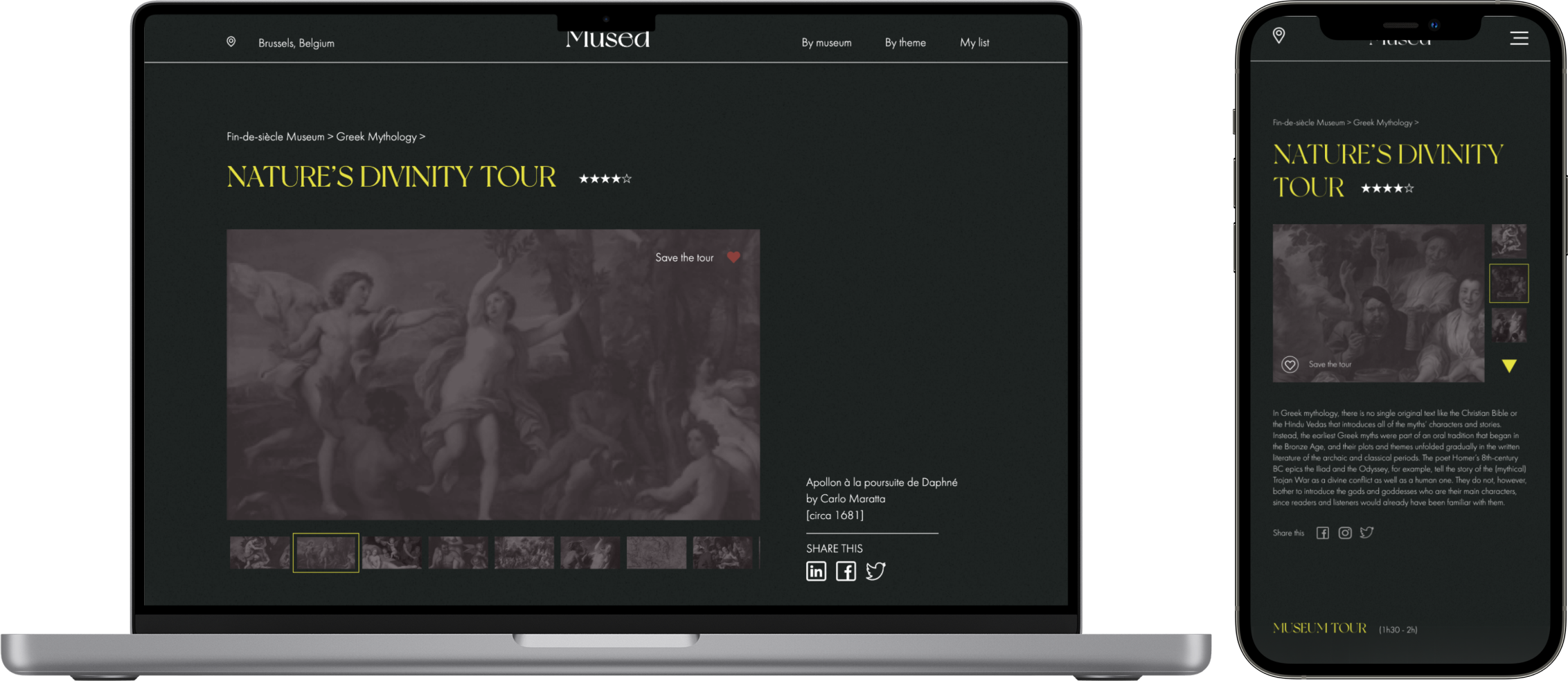
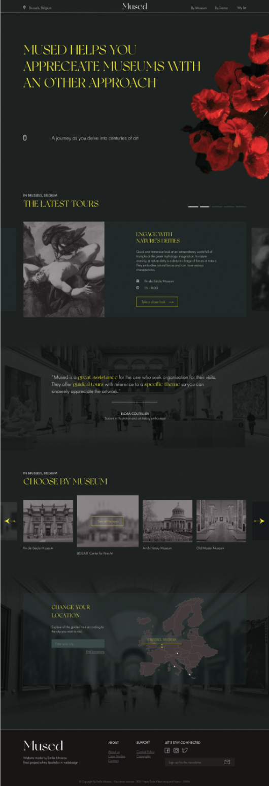
The landing page is a presentation of the website. Users are invited to look at the latest or most popular tours, they can change their location in order to have a more personalized website. However, the most important feature is the navigation bar where they are invited to find a guided tour either by museum, theme, or from their saved list.
Regarding the page for the guided tour, it would be the most important page as it is what users will spend the most time on. The page would include a small introduction to the theme, some images of the artwork, a map of the tour, and some information about the museum. There would also be a star rating, a “save” button to add the tour to a “saved list”, and a link to the fictional app.
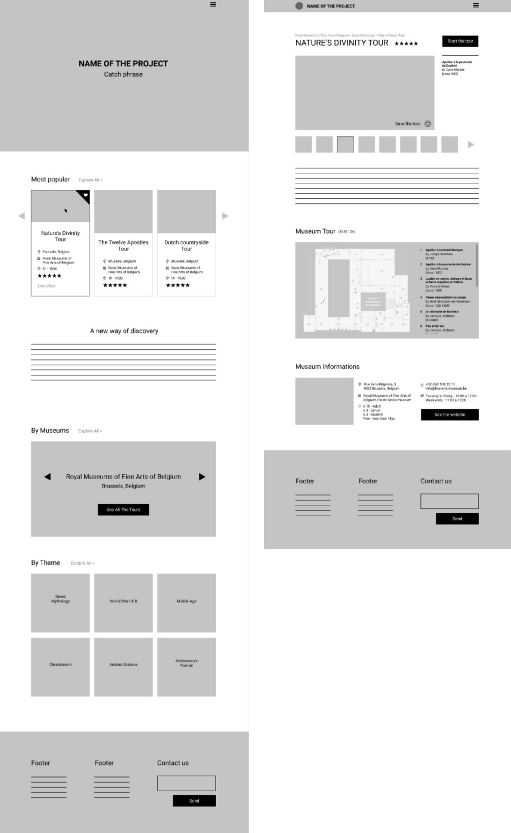
I transformed the initial prototype with real images and text as it would be better to visualize the functionalities. I also cleaned up some elements in the wireframe that were not clear. For example, I knew that I wanted to adapt my website to multiple museums and different cities. However, on my landing page, I needed to bring forward the main subject of my project, which was the tours and not the location. It had to be secondary. In that way, the main purpose of the website would be comprehensive even for someone who doesn’t speak English.
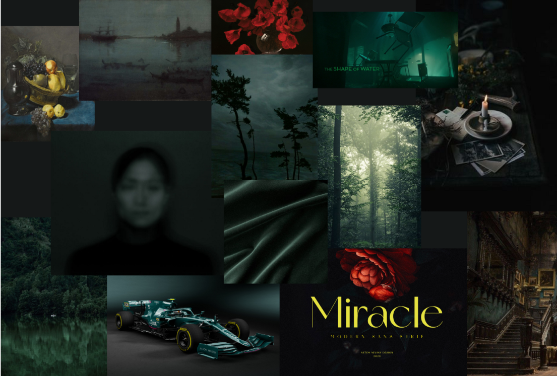
Afterward, I decided to create a graphic identity and apply it to my wireframe. I chose a dark theme with an accent color. I wanted something elegant and luxurious but which was still soothing and soft. I created my own dark academia mood board: dark green that tends towards turquoise, some textured transparency, and of course a reminder of paintings with painted illustrations. After some tries and errors, I found something I was satisfied with.
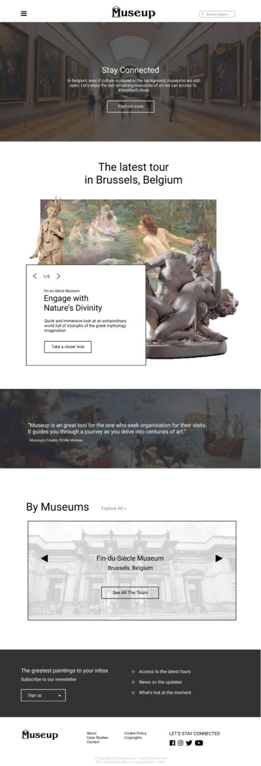
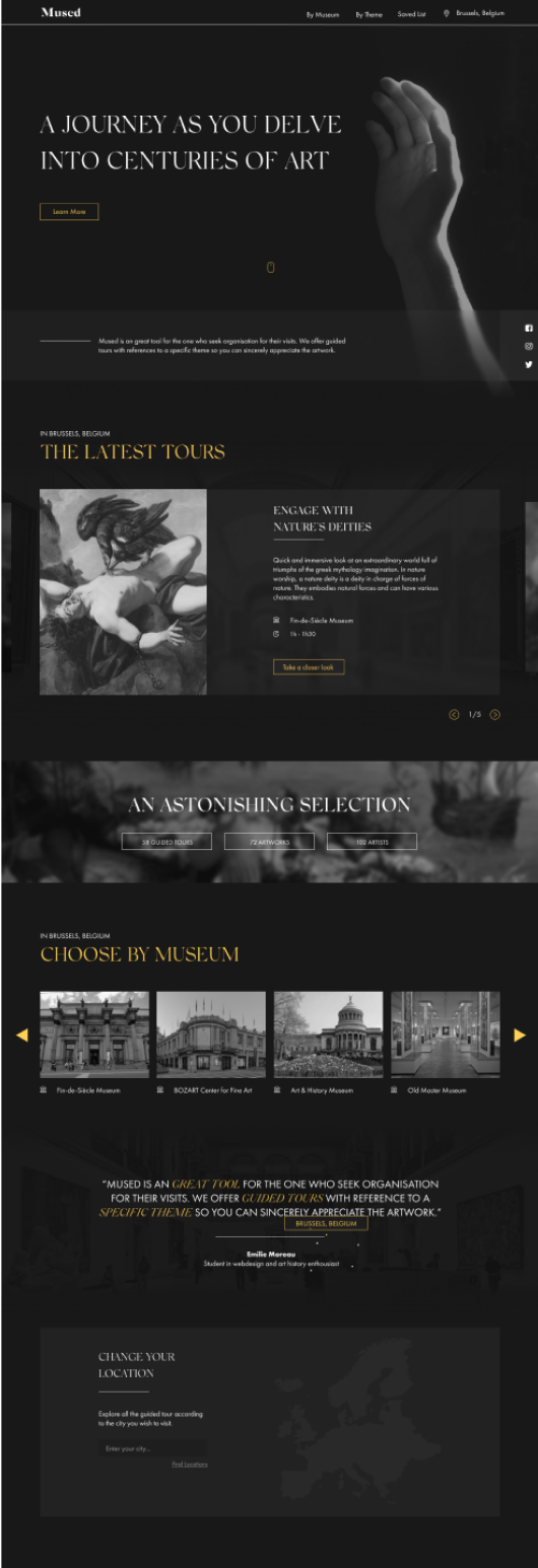
After I found good ground for the desktop format, I could arrange a design system. Then, it would be easier to adapt my landing page to a tablet and mobile format and create a new hierarchy ratio. At this point, it is not complicated to apply my graphic identity to all my pages so I move straight to coding my website. If you wish to see my wireframes in more detail, please visit my Behance.
My first initiative as I started coding was to create a structure in my work to stay as organized as possible and to know every step of the way what my next move would be. I used Webpack to be able to serve files while developing. When that was established, I began coding in mobile-first as I was always advised to do so. The responsiveness would be coded at the end.
I chose to code in SASS for the first time instead of CSS. I always knew it was more pleasant to work with it due to variables, importation of stylesheets, etc. However, it was a risk for me because I never used it before. But I learned on the job, and actually, it was not that complicated once I got the hang of it. Indeed, it was very nice to work with and I liked that everything was grouped and tidy. With all that in place, I created all the files I would need for my different pages and started developing my website.
I chose to start coding the common part of my website that would end up on all the pages: the fixed header and the footer. Then, I focused on the sliders which were a big part of the presentation of the tours. I ended up using a library to help me because JavaScript is not my strong suit. I used Flickity which was really easy to use.
After 2 weeks of coding on and off, the landing page was almost finished. After that, it was easy to follow the guidelines that I had established in my design system, and just like that I was done. There will always be some details to work on like the contrast of my colors or a personalized slider. However, because time was of the essence, I chose to focus on the main functionalities of my website.
In general, I received good feedback from the jury. They all thought that the visual aspect of my website was beautiful and should be on exposed Behance. However, I think I lost points for the code. I think sometimes I did not use the appropriate method for certain things. Nevertheless, I am proud with myself as I know that I do not want to be a developer. Because I had to work completely alone (and during COVID time), it was challenging for me and I am happy I have a minimum-viable final product. I enjoyed doing this project and I keep a positive memory from it, even after my master's.